NASA’s Top 19 Typography Tips

From Smithsonian Magazine, the typography tips NASA shares with anyone creating content for them: 

1. Sans-serif fonts are usually more legible than fonts with serifs.

2. Avoid using a font that has characters that are too similar to one another, as this will reduce the legibility of the print.

3. Avoid using dot matrix print for critical flight-deck documentation.

4. Long chunks of text should be set in lower case.

5. If upper case is required, the first letter of the word should be made larger in order to enhance the legibility of the word.

6. When specifying font height, or accessing graphs to determine the size of a lower-case character, the distinction between “x” height and overall size should be made.

7. As a general recommendation, the “x” height of a font used for important flight-deck documentation should not be below 0.10 inch.

8. The recommended height-to-width ratio of a font that is viewed in front of the observer is 5:3.

9. The vertical spacing between lines should not be smaller than 25-33% of the overall size of the font.

10. The horizontal spacing between characters should be 25% of the overall size and not less than one stroke width.

11. Avoid using long strings of text set in italics.

12. Use primarily one or two typefaces for emphasis.

13. Use black characters over a white background for most cockpit documentation.

14. Avoid using white characters over a black background in normal line operations. However, if this is desired:

1. Use minimum amount of text. 
2. Use relatively large typesize.
3. Use sans-serif to minimize the loss of legibility.

15. Black over white or yellow are recommended for cockpit documentation.

16. Avoid using black over dark red, green, and blue.

17. Use anti-glare plastic to laminate documents.

18. Ensure that the quality of the print and the paper is well above normal standards. Poor quality of the print will effect legibility and readability.

19. The designer must assess the age groups of the pilots that will be using the documentation, and take a very conservative approach in assessing information obtained from graphs and data books.

 
/Source

Antonio Ortiz

Antonio Ortiz has always been an autodidact with an eclectic array of interests. Fascinated with technology, advertising and culture he has forged a career that combines them all. In 1991 Antonio developed one of the very first websites to market the arts. It was text based, only available to computer scientists, and increased attendance to the Rutgers Arts Center where he had truly begun his professional career. Since then Antonio has been an early adopter and innovator merging technology and marketing with his passion for art, culture and entertainment. For a more in-depth look at those passions, visit SmarterCreativity.com.

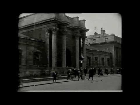
Oxford University Press and the Making of a Book

A silent film made in 1925 by the Federation of British Industry. This film was one of a series illustrating industrial life and it highlighted the Press's work to audiences around the world. Film courtesy of the Oxford University Press Archive.

Great find by my friend Sal Destro


/Source

Antonio Ortiz

Antonio Ortiz has always been an autodidact with an eclectic array of interests. Fascinated with technology, advertising and culture he has forged a career that combines them all. In 1991 Antonio developed one of the very first websites to market the arts. It was text based, only available to computer scientists, and increased attendance to the Rutgers Arts Center where he had truly begun his professional career. Since then Antonio has been an early adopter and innovator merging technology and marketing with his passion for art, culture and entertainment. For a more in-depth look at those passions, visit SmarterCreativity.com.

20 Creativity Quotes Beautifully Illustrated From Ogilvy & Mather

Antonio Ortiz

Antonio Ortiz has always been an autodidact with an eclectic array of interests. Fascinated with technology, advertising and culture he has forged a career that combines them all. In 1991 Antonio developed one of the very first websites to market the arts. It was text based, only available to computer scientists, and increased attendance to the Rutgers Arts Center where he had truly begun his professional career. Since then Antonio has been an early adopter and innovator merging technology and marketing with his passion for art, culture and entertainment. For a more in-depth look at those passions, visit SmarterCreativity.com.

The History of Typography, in Stop-Motion Animation

Yukon-based designer Ben Barrett-Forrest has crafted this charming stop-motion history of typography, built with 2454 photographs, 291 letters, and 140 hours of his life. Pair this video with typography explained

 
/Source

Antonio Ortiz

Antonio Ortiz has always been an autodidact with an eclectic array of interests. Fascinated with technology, advertising and culture he has forged a career that combines them all. In 1991 Antonio developed one of the very first websites to market the arts. It was text based, only available to computer scientists, and increased attendance to the Rutgers Arts Center where he had truly begun his professional career. Since then Antonio has been an early adopter and innovator merging technology and marketing with his passion for art, culture and entertainment. For a more in-depth look at those passions, visit SmarterCreativity.com.

The Whitney Museum New Graphic Identity

The Whitney Museum has a new mark: a dynamic W that responds to the artworks and words around it. Designed by Experimental Jetset, the new graphic identity embraces the inventive spirit of the Museum, and signals other changes afoot as the Whitney prepares to move to its new building in 2015. Be sure to check out the case study


Antonio Ortiz

Antonio Ortiz has always been an autodidact with an eclectic array of interests. Fascinated with technology, advertising and culture he has forged a career that combines them all. In 1991 Antonio developed one of the very first websites to market the arts. It was text based, only available to computer scientists, and increased attendance to the Rutgers Arts Center where he had truly begun his professional career. Since then Antonio has been an early adopter and innovator merging technology and marketing with his passion for art, culture and entertainment. For a more in-depth look at those passions, visit SmarterCreativity.com.